Eye Candy
- Thread starter MylesBAstor
- Start date
You are using an out of date browser. It may not display this or other websites correctly.
You should upgrade or use an alternative browser.
You should upgrade or use an alternative browser.
steve williams
Site Founder, Site Owner, Administrator
Besides their sonics, many of today's turntables could be featured in The Museum of Modern Art (put the B&O crap in the dumpster where it belongs!).
Which manufacturer's effort do you think epitomizes high-end audio eye candy?
One table that I think fits that category is Judy Spotheim's SPJ La Luce CS Centroventi turntable:
http://www.arcici.net/turntable.htm
gotta love the top of the line Clearaudio at $150K and also the pictures of Andy Payor's proposed Sirius V due out soon
steve williams
Site Founder, Site Owner, Administrator
that's it......$150K
now find a photo of Andy's proposed Sirius V
I have a conceptual design for a turntable inspired by the likes of these two beauties, plus it would look sort of like a musical instrument. One day I hope to post it.
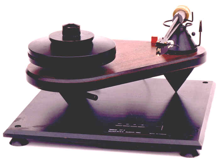
Meitner - Museatex - Melior AT-2
http://www.museatex.com/
http://www.museatex.com/at2.htm

Oracle Delphi
http://www.theanalogdept.com/phonosophie.htm

Meitner - Museatex - Melior AT-2
http://www.museatex.com/
http://www.museatex.com/at2.htm

Oracle Delphi
http://www.theanalogdept.com/phonosophie.htm

Yep, two good choice Kach! The Oracle has always been a looker. Meitner's table also could go into the category of ???? with its platterless concept.
OTOH, Ed's imedance matching and ground breaking devices that went between components definitely improved the sound of the system. And I think Ed's Museatex preamplifier was one of the first high end units with a remote, if attached, control!
OTOH, Ed's imedance matching and ground breaking devices that went between components definitely improved the sound of the system. And I think Ed's Museatex preamplifier was one of the first high end units with a remote, if attached, control!
How about this one:
Yes, thought about AJ's statement table...but just couldn't make my mind up about how felt about the look. What are other's thoughts?
If Clearaudio's finest with the hanging dumbell has a right to be there so is this!
Meitner's is eye candy:simple and graphic.The Clearaudio may get the job done but looks like a cathedral!
Another Teutonic in heart (but Japanese) design of yesterday was the Pioneer P-3a.Simple and effective.If you see one for sale please email me!
As cathedrals go, check out the Lusso by Montegiro.MOMA material!
If you want functional simplicity check out the top Brinkmann and the Simon Yorke designs.I think Myles can find the photos...
steve williams
Site Founder, Site Owner, Administrator
eye candy is one thing but how do they sound Myles
BTW I listen with the lights out so for me it is all what light up my auditory nerve
BTW I listen with the lights out so for me it is all what light up my auditory nerve
Myles-I can't stand the look of the SPJ table-it actually hurts my eyes to look at it. The other table with the zebra stripes on cones is also butt-ugly IMO. As for AJ's table, it looks like a machinist/tool and die maker/mechanical engineer designed it. Therefore, it is very machine shop looking. If you love the look of machine tools, then you will like the looks of this table. For me, it is too industrial looking in a machine shop sort of way.
The best looking table is the table I own of course. Seriously, I do like the looks of my VPI TNT table on top of the VPI TNT stand. I think the ET-2 looks cool mounted to it as well. I would like to complete the look and get the micrometer dial for the top of the ET-2. I think the Rockport table should really get the nod all kidding aside. That is a form-follows-function table that I think looks stunning.
Mark
Last edited:
Myles-I can't stand the look of the SPJ table-it actually hurts my eyes to look at it. The other table with the zebra stripes on cones is also butt-ugly IMO. As for AJ's table, it looks like a machinist/tool and die maker/mechanical engineer designed it. Therefore, it is very machine shop looking. If you love the look of machine tools, then you will like the looks of this table. For me, it is too industrial looking in a machine shop sort of way.
The best looking table is the table I own of course. Seriously, I do like the looks of my VPI TNT table on top of the VPI TNT stand. I think the ET-2 looks cool mounted to it as well. I would like to complete the look and get the micrometer dial for the top of the ET-2. I think the Rockport table should really get the nod all kidding aside. That is a form-follows-function table that I think looks stunning.
Mark
A vote for the VPI! Used to have your combo and it was real nice. The VPI is a great platform for the ET.a
What's your opinion of the Clearaudio?
Another table that is striking in its simplicity is the new Goldmund Reference.
Yeap!That's it-a sculpture in metal!
Let's see hoto of the P-3a http://www.thevintageknob.org/PIONEER/P3/P3.html of the PL-L1 www.thevintageknob.org/PIONEER/PLL1/PLL1.html,
the Simon Yorke designs http://www.recordplayer.com and the "all business" Brinkmann http://www.audiofederation.com/catalog/turntables
Let's see
the Simon Yorke designs http://www.recordplayer.com and the "all business" Brinkmann http://www.audiofederation.com/catalog/turntables
Last edited:
.jpg)
nothing really over-the-top with these three tt's, but i do enjoy their look.
i guess it's like your kids, they all look nice to Dad.
steve williams
Site Founder, Site Owner, Administrator
Mike
that is beyond gorgeous. It is almost sinful. How do you ever decide what TT and cartridge to use
that is beyond gorgeous. It is almost sinful. How do you ever decide what TT and cartridge to use
I would like to have the first one please (the ugly Darth Vadder looking and not at all photogenic at the back).
I suppose it's the one you seldom use...I promise i will dust it off and polish it every day-maybe twice a day!
It really spoilds the show for the other two...such a shame!
I suppose it's the one you seldom use...I promise i will dust it off and polish it every day-maybe twice a day!
It really spoilds the show for the other two...such a shame!
steve williams
Site Founder, Site Owner, Administrator
.jpg)
nothing really over-the-top with these three tt's, but i do enjoy their look.
i guess it's like your kids, they all look nice to Dad.
Mike
what component is directly under your middle TT
Mike
what component is directly under your middle TT
Steve,
that's the Allnic H3000 phono stage under 'The Beat' tt. under the right hand tt (Dobbins-Garrard 301) is the darTzeel NHB-18NS. the Allnic has 4 inputs and darTZeel has 2 separate phono pre's in it.
Mike
Mike
that is beyond gorgeous. It is almost sinful. How do you ever decide what TT and cartridge to use
i do feel fortunate to enjoy these tt's. these days lots of guys have multiple tt's mostly because it's fun messing with tt's....and.....well....they are cool. not only that; Chicks dig tt's.
i'm still coming to grips with the answer to your question....and will try to answer that for myself in the coming months. when i figure it out i'll share.
btw; the tt in the middle is the pre-production version of Steve Dobbin's 'The Beat'. it was in my room a month ago and i did purchase one. it's suppose to be delivered to me in a month or so. i still have my Dobbin's plinth'd Technics SP-10 Mk3 which will be a trade-in on 'The Beat'. i'm still trying to figure out what color i want my 'Beat' to be.
I would like to have the first one please (the ugly Darth Vadder looking and not at all photogenic at the back).
I suppose it's the one you seldom use...I promise i will dust it off and polish it every day-maybe twice a day!
It really spoilds the show for the other two...such a shame!
yes; the 'ugly duckling' on the left is a brute. but it's not going anywhere. they'll likely bury me with it. there is a long line of folks who have offered to take it off my hands as a favor to me; it's great to have friends that really care. i would never think of burdoning anyone with that sort of 'issue'.
EDITED - SEE ORIGINAL POST.
Soundofvoid; I'm having problems with your links, can you go back and fix them?
EDIT: Thanks for fixing the links.
Last edited:
Similar threads
- Replies
- 0
- Views
- 529
- Replies
- 4
- Views
- 2K
- Replies
- 0
- Views
- 678
- Replies
- 3
- Views
- 429


