Official Thread to Report Bugs, Concerns or Suggestions With The New Site Platform

Status
Not open for further replies.
David what you still find difficult to comprehend is What's New is more than just new posts. It also Whats new in Media, authors, posts etc

This is the way it is for now David. It isn't that difficult for you to comprehend. If I can navigate my way through, then so can you

Enough said

It's the combination with "New Posts" that's throwing me off and the way one has to navigate to these menus on a computer and differently again on Mobile, that's another layer of figuring it out again. The whole thing can be done under one menu and much more efficiently with fewer clicks. But don't look at this only in my context it's frustrating for others too and is this type of navigation can be a turnoff for new visitors to the site. You're in a different position working directly with the developer, I'm coming from a user perspective.

david
 
I understand your position completely.

However the way the site is set up now is such that we have lots of breathing room and can easily grow into this present format rather than what we had prior where there was never a work around. Hence we grew out of it with no good Vbulletin support. Hence Xenforo.

I suggest it is a learning issue David. That doesn't mean there aren't work arounds but these solutions don't always come free as the support often costs money to do the work around. I don't know the first thing about code. Astrostar excels at code however there are times when things we do must involve the solicitation of support for someone to write some code for us..
On a good note my email alerts started working again!

david
 
This is to point out a small but somewhat important navigational inconsistency.

The issue is: how do I go to the last (most recent) message in a thread.

Here is one example of the inconsistency:

On the page FORUMS LIST, you click the Name of the thread to go to the last (most recent )mesage.
another: On the page VINYL FORUM, you click the Name of the thread to go to the last mesage.
- however -
On the page GENERAL ADUIO FORUM, you click the Name of the thread to go to the first mesage.
On the page GENERAL ADUIO FORUM, you click the Timestamp to go to the last (most recent ) mesage.

I suggest either using the Timestamp in all cases to go to the last message in a thread
-or-
Reinstate the small glyph ' » ' that was used in the prior forum as a clickable item to take you to the last msg. in a thread. (glyph is a standard ASCII 219)
 
  • Like
Reactions: bonzo75
can we get rid of this filter please.

1540212115445.png

it adds steps to every visit that are un-necessary. i want to see 'all' the posts so i can oriented properly. and i want to see the thread i just posted on......which is the likely place i want to post on anyway. until i get rid of this filter it hides some threads.
 
can we get rid of this filter please.

View attachment 44784

it adds steps to every visit that are un-necessary. i want to see 'all' the posts so i can oriented properly. and i want to see the thread i just posted on......which is the likely place i want to post on anyway. until i get rid of this filter it hides some threads.

That filter Mike is only in "New Posts" not in "What's new". Seems to me you can find what you are looking for in Whats New

BTW when I go to New posts and click on "Show Only Unread, the filter disappears, so am I misunderstanding you as the filter disappears when I click on it
 
This is to point out a small but somewhat important navigational inconsistency.

The issue is: how do I go to the last (most recent) message in a thread.

Here is one example of the inconsistency:

On the page FORUMS LIST, you click the Name of the thread to go to the last (most recent )mesage.
another: On the page VINYL FORUM, you click the Name of the thread to go to the last mesage.
- however -
On the page GENERAL ADUIO FORUM, you click the Name of the thread to go to the first mesage.
On the page GENERAL ADUIO FORUM, you click the Timestamp to go to the last (most recent ) mesage.

I suggest either using the Timestamp in all cases to go to the last message in a thread
-or-
Reinstate the small glyph ' » ' that was used in the prior forum as a clickable item to take you to the last msg. in a thread. (glyph is a standard ASCII 219)
another good find tima, thank you
 
That filter Mike is only in "New Posts" not in "What's new". Seems to me you can find what you are looking for in Whats New

BTW when I go to New posts and click on "Show Only Unread, the filter disappears, so am I misunderstanding you as the filter disappears when I click on it

Mike , it seems me that if you click Latest Activity you can also find what you want there
 
Just a comment:
As an original member of WBF there was a learning curve regarding the use of WBF. Now you have to unlearn some things and learn new ones. I don't think I ever really took advantage of all it had to offer. "Better is the enemy of good." I remember when I converted from paper to digital calendar. I had to wait for the computer to boot up and locate the calendar app. However its ability to automatically remind me of upcoming events was invaluable.
Give it time. It's sorta like the foreign exchange student to Russia. They not only put her in an advanced Physics class she was not allowed to speak any English. She cried many nights before she caught on.
Okay, I have to go to Sprint today to learn how to upload pictures from my Samsung S9+ to my laptop. I need to post results of my hearing test. Also, I may actually make it to Capitol Audiofest this year. My smartphone is now my primary camera.

Technology is wonderful/
 
To Mike and David, I do understand your concerns and want to make everyone aware that these suggestions or requests are not falling on deaf ears as we look into each and every suggestion. Some are quick fixes and others are not so obvious and that requires us submitting requests to the Xenforo team to create a work around for us

I sense that everyone is feeling a short fuse and hoping to wake upon morning and find all the suggestions in effect. Trust me when I say that we are working daily to make this happen. I must admit that I am feeling that strain myself due to the daily man hours of commitment. We are determined to make this right and I sense that each day we are getting a little closer.

More than anything however I understand the comments about the confusion regarding "buttons" that seem redundant or counterintuitive. In the past we were on a site that dealt only with threads and posts. This new platform brings with newsfeed, media, articles, threads and posts so those buttons are used for those many functions. Hence the confusion

Let us look into this for everyone so that the site becomes streamlined. I still have my own questions as well so i am determined to get this right. This is a work in progress and has been going on daily now for the past 9-10 weeks. The good news is that unlike Vbulletin, Xenforo does have workarounds. If they don't exist usually someone can write the code to make it happen. We have a lot on our plate now so please give us a chance as there are so many things to consider on a daily basis
 
It's the combination with "New Posts" that's throwing me off and the way one has to navigate to these menus on a computer and differently again on Mobile, that's another layer of figuring it out again. The whole thing can be done under one menu and much more efficiently with fewer clicks. But don't look at this only in my context it's frustrating for others too and is this type of navigation can be a turnoff for new visitors to the site. You're in a different position working directly with the developer, I'm coming from a user perspective.

david
The mobile menu is new to the forum and had to be done to be complaint with Google. They were killing our forum before in vBulletin as that software didn't meet the Google mobile standard they brought out mid 2018.

Standard navigation tabs are not mobile friendly.

On the 'too many tabs' I can deactivate them as we all see fit. I am waiting for a decision on that. Or they can be moved I think as well.
But it is key not to remove a tab that goes to (for example) new media, or threads watched etc.
I don't want to get into modifying tabs and fields at this point but what I'm trying to understand is how or why the Google standards are effecting this site but none of the the others I navigate to, including bank accounts and major retailers. I use Safari, Chrome & FireFox on the computers, Safari & Chrome on mobile devices. When using a browser there's no difference in the interface wether I log on with a computer or a mobile device, it's only the App that's different. What is it different for WBF?

david
 
Google sets the standards David. Perhaps the other sites don't care about SEO. We do, so everything counts. It matters not what app you use. Every site has a global and one's ranking in their country. You are seeing it one way but we are seeing it the way necessary for SEO.

The mobile app and the live site is different. There is no getting around that as explained by Julian

I'm not talking about mobile apps or SEOs, the site has a different interface on my Safari browser on the computer and another for the Safari browser on the iPad. I guarantee you that Chase, BOA, Citi, Amazon, etc., etc. are more up on their SEO than most, there's not navigational difference using a browser on a computer or a mobile device.

david
Hello David
I beg to differ. Most websites I go to including my own bank have a top navigation, then collapse to a stacked navigation.
https://www.halifax.co.uk

It is something we have to provide now. Google set out their terms, I didn't have any influence over that. They actively punish websites that are not flex layout and have a stacked mobile menu. So if we stayed on horizontal navigation and fixed layouts we would effectively be dead as far as Google is concerned.
 
Back to the main (recent) subject, I detail here the navigation tree as it is now. I can deactivate any I like as long as I see that that entry or feature is not required. In my view, it is not a problem in any modern website to have multiple entries to the destination page that person wants to view. Like we travel to a town and there are 3 roads in, 3 roads out. We also now have ways (new ways) to get to relevant content via the Alerts and Inbox flags top right. On head-fi.org I tend to use those more than anything else.

Navigation tree today (I have tweaked it today):

Home
No further navigation tree (I have removed them)

Forum
> New Posts
> New Activity (I have removed this as it is the same thing, just thread order by title or thread order by member name commenting
> Find Threads > Your Thread, Threads with your post, Unanswered threads
> Watched > Watched thread, Watched forums (posts or threads you have marked as watched by you)
> Search (search for content and use filters)
> Mark as read (bit like email)

What's New
I have deactivated this whole section and moved the posts bits to the Forum tab above, and the Media bits to the Media button below. It is simpler now and less doubling up. We don't need it in our case at the moment.

Media
> New Media
> Add Media
> Your Content (media) > Your Media, Your Albums
> Watched > Watched Media, Watched Albums, Watched Categories.
This will become more relevant as we progress and anchorage members to posts photos of the systems, set up albums of photos, photos contained in a review by tha member etc.
> Watched Categories I can create categories, so we already have Member Systems.

Members
> big list of members

Donate
> donate via PayPal to WBF

Plus we also have the (fantastic) new feature of Account tab, with Account, Inbox and Alert.

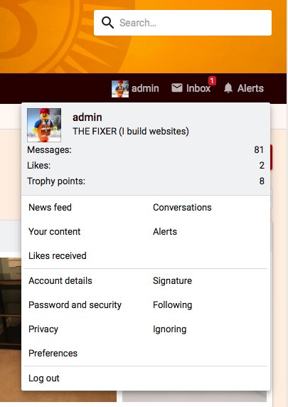
Account
gives you access to your signature, conversations, following, albums etc.
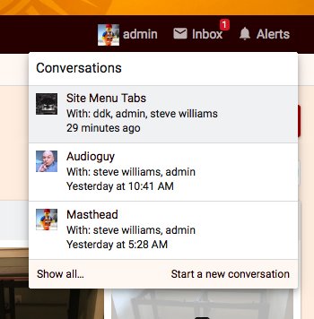
Inbox
is like your own private email, so PMs with members or discussions in an Admin thread.
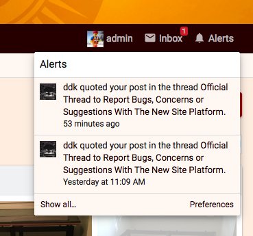
Alerts
is a quick way to get to members who have replied to your post, quoted your post, or added a post you have recently been posting into.

I use the above tabs a LOT and love this feature. I first saw it on head-fi.org and have used it since they updated for 14 months. 500k users (and climbing) on that forum also do the same, and seem happy with it. They are in Xenforo 1.5, we ar win Xenforo 2.0.9, so a later and better version.
3.jpg2.jpg

1.jpg

Guys, IMO we are in a better place now. Ok a few disagreements, it is normal. But we are getting towards a point where we can take WBF to the next level. The web moves at a rapid pace, and we will be lost in it otherwise. We have great content on WBF, and great members who know a LOT about high-end audio. I stopped using AGon forum 2 years ago, but came here instead.

Our big idea is to empower the member base, use photos and the great text / data set in the forum, and get us out there more. That is how we will go from strength to strength. I am not saying I know it all, I am the web guy. But I do have 28 years experience in the graphic industry so have 'some idea'. I am also an audio nut like everyone else on here. What I am trying to avoid is the software bashing. Rather we have ordered requests and look at those as we move forward.

I hope this explains things better.

So we are all this together, it is a great thing we have here. And we need to shout a bit louder about it. Other are doing just that and their forums are, well, I won't say anything on that. But you get my drift.
 
I'm not talking about mobile apps or SEOs, the site has a different interface on my Safari browser on the computer and another for the Safari browser on the iPad. I guarantee you that Chase, BOA, Citi, Amazon, etc., etc. are more up on their SEO than most, there's not navigational difference using a browser on a computer or a mobile device.

david
Amazon on my iMac, the top navigation is full width with maybe 15 different items. On my Huawei phone is has 4: Deal, Prime, Video, Music and above that is a collapsed menu bar....that goes to a stacker format.

I don't want to disagree but....
 
Hello David
I beg to differ. Most websites I go to including my own bank have a top navigation, then collapse to a stacked navigation.
https://www.halifax.co.uk

It is something we have to provide now. Google set out their terms, I didn't have any influence over that. They actively punish websites that are not flex layout and have a stacked mobile menu. So if we stayed on horizontal navigation and fixed layouts we would effectively be dead as far as Google is concerned.

So if I understand correctly basically the stacking menu is a must?
david
 
If I can park this please. If we have an old style website navigation bar, on a mobile it is a NIGHTMARE to navigate. Fingers are just to wide to get to the buttons. Remember the drop down action doesn't work on a phone or iPad, it just tries to load that link. Thus you are forced to use a stacker menu. The stacker ONLY appears when the window goes down to 600px wide, so doesn't affect laptops and home computers.

In other words, websites that stay on old style fixed width menus will loose customers, and have really annoying horizontal scrolls to bits the window has just chopped off, and navigation that is unusable. 45% of all users online now are on a phone.
 
Status
Not open for further replies.

About us

  • What’s Best Forum is THE forum for high end audio, product reviews, advice and sharing experiences on the best of everything else. This is THE place where audiophiles and audio companies discuss vintage, contemporary and new audio products, music servers, music streamers, computer audio, digital-to-analog converters, turntables, phono stages, cartridges, reel-to-reel tape machines, speakers, headphones and tube and solid-state amplification. Founded in 2010 What’s Best Forum invites intelligent and courteous people of all interests and backgrounds to describe and discuss the best of everything. From beginners to life-long hobbyists to industry professionals, we enjoy learning about new things and meeting new people, and participating in spirited debates.

Quick Navigation

User Menu