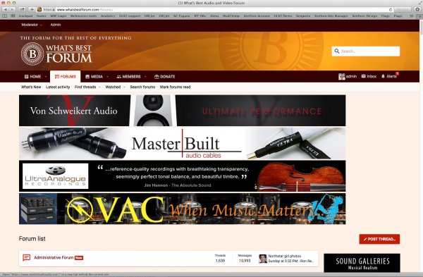
Official Thread to Report Bugs, Concerns or Suggestions With The New Site Platform

Status
Not open for further replies.
Steve mentioned that some members are finding the new format and color scheme to be "bland." Well I sure hope so!

"Bland" means that we are looking at pleasing colors which are non-fatiguing and upon which text is easy to read. We can stare at this pleasant Financial Times light peach/off-white background color for hours and not get a headache. That is exactly what I personally want for our website!

If someone wants to see "pizazz" he should turn on the television set! :D

I have zero interest in distracting pizazz.

Neutral walls let you decorate with art - here that would be people's posts and pictures.
 
I have zero interest in distracting pizazz.

Neutral walls let you decorate with art - here that would be people's posts and pictures.

That is precisely our point as well tima. We selected a color that has successfully been used in a British newspaper for countless decades because it is soft and soothing on the eyes. Like you our intent is to increase our "media" storage for everyone to see.
 
  • Like
Reactions: Ron Resnick
FWIW, no one to my knowledge complained about the colors, and if I/others did, it may have been early right after the cutover. We mainly complained about how boring the presentation is, due to the squareness of things, the lack of highlighting of text, unlike the WBF or yore or other sites, and that sort of thing. My decision to significantly stop reading and participating on the site is entirely mine and is entirely based on its new look and feel, which makes conversations extremely hard to follow, and looks uninteresting unlike the old WBF which I loved. You surely cannot please everyone, but FWIW, I will just say, the old site's presentation had extremely few problems, and nowhere near the new one's... Again, FWIW to you. If you like what you have right now, that settles it.
 
  • Like
Reactions: opus112 and ddk
+1 here

Also, just because a color works for print doesn't mean it works on a screen

As an aside, I know how much work is involved with this new site. The pitfall is that those working on it constantly always have a tendency to overlook the obvious things that make sense to them but would not to others.
My thought is your beta testing/testers was not broad enough and were probably too close to the process. The banners at the top are over the top, the line listing in the main forums needs separation, etc.

I do not know what the adaption numbers are but it sure seems like the activity is way down.
 
New format works for me. The change seems overall better to me and is much less obnoxious than the constant updates and forced pushes our IT department does. And I appreciate having the "New Posts" buttons right at hand!
 
Ack, why are “conversations extremely hard” to follow now?

Thank you.
 
Ron,

I don't want to belabor the points already made, nor impose my view of the web world. But color isn't the problem. There is a thing called UI Usability, which is about how things are presented that make one _want_ to view the content, and keep him on it. A few posts upthread, I posted an example of how text should be highlighted, and is something the old site also did really well. This new site is bland - just regular plain text, in rectangular boxes, more boxes inside boxes, sometimes spaced away from each other (threads) but not elsewhere (activity stream). The word 'uninviting' comes to mind, as I have said, which simply translates to "why would I care to see what people say, if I can't stand the presentation" - that's what makes discussions hard to follow, the lack of usability. If I had to pick a few words to describe improvements, I would use "contrast", "rounder", "logical", "flow", "consistent" - that's the pizzazz I am referring to.

Usability is a large subject, and though I am not an expert, I have guided teams in the past in making the UI more presentable, and perhaps you can consider a couple of simple examples, far less important than the boxiness and other issues I mentioned above, but still subtly important in themselves:

a) Natural behavior: when viewing activity, there is a Show Older Content link on the bottom right - this used to be on the bottom left in the old site and everywhere else, and for good reason: our brains read from top to bottom and left to right in that order of priority (notice how top news on just about any news site are placed on the top left, and the least important content, on the bottom right); so before, as I naturally read content on the left all the time, I could easily locate the More Activity link on the left; but now, I have to switch focus to the bottom right to click Show Older Content, and it's distracting to be doing it all the time. The reason they put that link on the bottom right now, however, is because it works well when viewing on a mobile device, and since most people are right-handed, it's natural to blindly click that link with the right thumb, while the eyes are still focused on the left looking at content, plus that link is very close to everything else because of the small real estate, so it's not distracting. However, this does not work well when viewing on a much wider computer screen.

b) Predictability: the New Posts and Latest Activity links are all over the place, depending on what one is viewing - there is no predictability of where to find frequently used links and functions, causing distraction; they jump around; this was not the case before, or on other sites. The eyes should be focused on the content all the time, the content should have enough contrast with bold typeface as appropriate (see example again in previous post) to make it easy to read (and I intentionally did not highlight parts of my post here, to see how tiring readig all this can be), and whatever clicks are to occur should not distract the user from the focusing on the content. As an example, if you are to watch people who text a lot, you may notice how their eyes are focused exclusively on the dialog area, and never really on the keyboard - that's because the keyboard is naturally placed, easy and predictable to use, therefore the eyes never lose focus.

c) Information overload: the activity stream is flooded with who-liked-what... so distracting and pointless

I could really go on and on, so I will say again, the old site, though not perfect, did most of the important usability things really well. New Posts and Activity Stream pages were so easy to read, really nice. My only qualm really about the old site was the dark colors, but I never said anything and lived with it. But at the core of it, the presentation was keeping me glued to the *content*. This is not happening here. Others may disagree. I do not mean to be a stickler, but that's what I see, and I just don't care to spend more than 5-10 minutes a day over here now. For the most part, I am really only scanning the activity for pictures of music albums, and that's about it. Posting all this right now was a real stretch for me, and now that I think about it, I really wanted to be typing on top of a white background; the pale pink color of this text area finally got to me (aren't we all used to writing on white paper?), and need to end this tirade.

Like audio, we are still talking about preferences here, so I don't mean to impose mine, but since you asked... But if people think this is the way web forums should look like and this is how to attract audiences, I'd respectfully say, please look around for other examples.
 
  • Like
Reactions: opus112
Thank you, Ack, for your detailed descriptions. I appreciate the time you spent writing all of that.

But I am afraid I am confused about something. How do your comments about visual display and locations of tabs address my question about why you are finding conversations extremely hard to follow?

I don’t understand why your thoughts on the visual display have anything to do with your difficulty following posts in conversations?

“Why would I care to see what people say, if I can't stand the presentation" does not make any sense to me at all. Short of the primitive UI of audioasylum in the bulletin board days (which I found very annoying and impossible to deal with) particular colors or location of tabs would not drive my decision as to which forums I wish to participate in.
 
Last edited:
  • Like
Reactions: ack
Thank you, Ack, for your detailed descriptions. I appreciate the time you spent writing all of that.

But I am afraid I am confused about something. How do your comments about visual display and locations of tabs address my question about why you are finding conversations extremely hard to follow?

I don’t understand why your thoughts on the visual display have anything to do with your difficulty following posts in conversations?

“Why would I care to see what people say, if I can't stand the presentation" does not make any sense to me at all. Short of the primitive UI of audioasylum in the bulletin board days (which I found very annoying and impossible to deal with) particular colors or location of tabs would not drive my decision as to which forums I wish to participate in.

Dear Ron,

I brought up exactly the same points almost identical to what Ack mentioned above with Steve & Julian, the UI is problematic for me too. The menu layouts and the way information is presented is unenegaging and offputing. Looking at the New Posts page, after being instructed by Steve and Julian how it works, which is another subject by itself is like going to to the type of buffet that you leave after circling the food bar once. The food might be fine but the presentation turned you off so you don’t even remember what was there, this is how I can best describe it. I too have a hard time following threads presented in this format and lose interest as soon as the Latest Posts roll out.

The inconsistency in the menus is another turnoff, it changes from page to page as does the position of the tabs. I don’t want to go through latest activity which I also hate for the reasons Ack mentioned (can’t believe I’m agreeing with him again ) only to find the doorway to the unappetizing buffet again. This is a basic design and execution issue, pretty straightforward to address if the will is there and has nothing to do with the kind of engine you use, any bugs that need ironing out or how many options you want to have down the line. It’s also not about pizazz, glitz or whatever else mentioned before, it has to do with a presentation that’s fast, easy to follow and engaging at first glance.

david
 
a) Natural behavior: when viewing activity, there is a Show Older Content link on the bottom right - this used to be on the bottom left in the old site and everywhere else, and for good reason: our brains read from top to bottom and left to right in that order of priority (notice how top news on just about any news site are placed on the top left, and the least important content, on the bottom right); so before, as I naturally read content on the left all the time, I could easily locate the More Activity link on the left; but now, I have to switch focus to the bottom right to click Show Older Content, and it's distracting to be doing it all the time. The reason they put that link on the bottom right now, however, is because it works well when viewing on a mobile device, and since most people are right-handed, it's natural to blindly click that link with the right thumb, while the eyes are still focused on the left looking at content, plus that link is very close to everything else because of the small real estate, so it's not distracting. However, this does not work well when viewing on a much wider computer screen.

Agreed we English speakers read left to right and top to bottom.

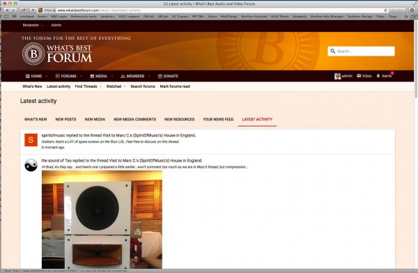
When I looked at 'Latest Activity', at the bottom of the page on the right was a link labeled 'Show Older Items'. To my way of thinking it is "naturally" placed on the right because we read left to right -and- that bottom right placement to go to the next page is analogous to turning a paper page.

Two points:

1. There should be consistency in how the forum offers the 'next page.' Most places use this type of widget: 2018-10-24_2-31-57.jpg
Higher numbers mean 'prior' or 'older'. If there other instances similar to 'Show Older Items' it and they should be standardized to the above.

2. When on a page that is one of many, the above Next Widget is found near Top Left and Bottom Left of the current page. I'll suggest it be placed Bottom Right based on the above rationale for having 'Show Older Items' on the Bottom Right.

(I realize this is contrary to ack prefering to turn the page from the bottom left. - sorry ack)
 
b) Predictability: the New Posts and Latest Activity links are all over the place, depending on what one is viewing - there is no predictability of where to find frequently used links and functions, causing distraction; they jump around; this was not the case before, or on other sites. The eyes should be focused on the content all the time, the content should have enough contrast with bold typeface as appropriate (see example again in previous post) to make it easy to read (and I intentionally did not highlight parts of my post here, to see how tiring readig all this can be), and whatever clicks are to occur should not distract the user from the focusing on the content. As an example, if you are to watch people who text a lot, you may notice how their eyes are focused exclusively on the dialog area, and never really on the keyboard - that's because the keyboard is naturally placed, easy and predictable to use, therefore the eyes never lose focus.

The inconsistency in the menus is another turnoff, it changes from page to page as does the position of the tabs. I don’t want to go through latest activity which I also hate for the reasons Ack mentioned (can’t believe I’m agreeing with him again ) only to find the doorway to the unappetizing buffet again. This is a basic design and execution issue, pretty straightforward to address if the will is there and has nothing to do with the kind of engine you use, any bugs that need ironing out or how many options you want to have down the line. It’s also not about pizazz, glitz or whatever else mentioned before, it has to do with a presentation that’s fast, easy to follow and engaging at first glance.

A general rule is: Don't Break User Expectations. Users come to this site having used other sites, including the prior WBF site, so some level of expectation is already set. For example, most of us know what a Login box looks like and how to use it. Most of us know the nomenclature 'Home'. Another expectation is that the site we're at should operate with internal consistency of terminology, option names, their locations, and what they do.

==> One mark of better sites is not having to think, hunt or peck about how to use the site. <== I can only speak for myself but we're here to talk about high-end audio stuff, not be UI revolutionaries. Many of us are older with little interest in change without value sufficient to put up with change. [I recognize the need to get off old unsupported software in order to go forward, so something had to happen.]

Another general rule: context sensitive navigation is to be avoided, certainly at the top levels. I agree with @ack and @ddk about some lack of consistency in some placements of navigation options within this new instance of WBF. If one wants a special or different set of navigation options, those need to be justified as to why it must be different otherwise changes to standard navigation break expectations.

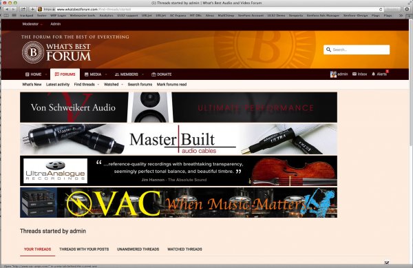
There are two top level menu sets that I discern. both shown here as ribbons:

2018-10-24_3-03-36.jpg
These should be consistent on every page. Their links should take you to the same place no matter what page you select them from.

Example of Inconsistency:

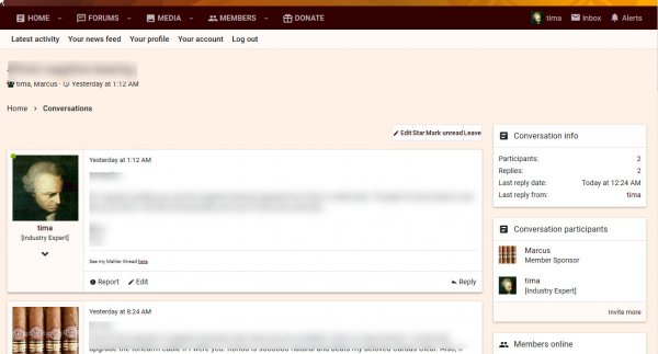
Here is a 'Conversation' page [note new terminology for what was labeled a 'private message']. The second menu ribbon is completely different. I haven't figured out why it's different; best as I can tell there is no reason for it to be different.

2018-10-24_3-08-24.jpg

I've run across this type of discrepancy in more places than just this example. If there is a strong reason for those second level ribbon options, there could be a third ribbon, while keeping the first two ribbons in place.

I suspect there are other different examples of inconsistency and/or confusing presentation that ack and ddk have in mind. My suggestion is to document and report each one specifically, ideally with a screen capture, and, if not, with clear enough description. Put the word NAVIGATION at the start of your message. This is a time consuming hassle but it's the only way to convey the information. Forgive me: Every issue/complaint needs a specific example.

I'd give enough time (2-3 weeks?) for these navigation reports to come in rather than change code with each report. Lay them out together for an overall review. There may be some patterns and there may be a way to resolve the issues collectively rather than each as a one-off.

These are only my thoughts stated somewhat declaratively. I believe our goal is mutual. Thanks for your forbearance.
 
  • Like
Reactions: opus112 and bonzo75
By the way I love the way one can swipe just a portion of a member's message and receive a 'reply' option, which, when clicked, inserts just the swiped text into a new message as a quote from that user.
-This is very cool.
 
  • Like
Reactions: bonzo75
A couple of points why I like this UI. I like the look and I like the new posts and the latest activity buttons next to each other. Those two are sufficient for most of my reading. I only need to click other stuff if I am posting a new thread. I also like the stream of who liked what, though I would prefer not to have loads of pics blocking my activity feed. But that is a small concern. I like to see who has liked what because it brings to notice some posts I might have missed.
 
I would like the PMs improved. I see that if we lock this conversation, which is meant to be only to not allow other people to join, the main addressee cannot reply either. He should be allowed to reply to a locked conversation
 
Hi Guys
I am reading all this this morning. The sub navigations are being worked on, to remove the inconsistencies. It take time to read the code and talk to Xenfor. It doesn't happen overnight.

I can look at moving some tabs from the right to the left.

Please bear in mind, any code changes I do costs money, takes a lot of time, and when we update Xenforo has to be done all over again.

I have used head-fi.org on Xenforo and enjoyed using that forum much more the WBF when we were on vBulletin. That form has 500K members, we have 8K. Please tell me why you think we should say on vBulletin. You do know vBulletin V4 was 2009, and the latest version is full of bugs, the mobile aspect is a disaster. The guys who built that software company left and set up Xenforo, and since vBulletin has decended into a train wreck.

Xenforo tweaks
Colours, they can be tweaked, changed. As can typefaces. Colour is subjective. We can have bold headings and red text, or we can keep it neutral and let the content speak. I prefer neutral. But id the consensus is bight red big text and blue panels, I can do that no problem.

If you think the threads look boring, use the WYSIWYG edit box and size and style your posts, add some colour. And add more photos, jazz things up a bit.

IMO we are majoring on drilling down to detail Xenforo v vBulletin differences, and ignoring what extra ways we have to get to the content. I can get around the forum fine, better than vBulletin. And remember vBulletin was a disaster on mobiles which are now 45% of all user WW.

So the software is a work in progress, we will look at comments and act on those that will be an upgrade for the members. But please, we need to slow down a bit, if I acted on every post here, I would be working 60 hours a week on this, and we don't have budgets for that level of customisations.
 
I would like the PMs improved. I see that if we lock this conversation, which is meant to be only to not allow other people to join, the main addressee cannot reply either. He should be allowed to reply to a locked conversation

The PMs is already so much better than used to be.
SWALLOW it big fella.

Tang :cool:
 
Thanks Tango, sometimes I feel like chucking in the towel, but we suck it up and carry on regardless, it is the British way LOL.

Ok, I have spent some hours this morning fixing the inconsistencies in the sub navigation. What happened I believe, is it was inconsistent in the original vBulletin built. And also we now have more pages and access points, so when I imported the data it didn't know how we wanted it set up in those areas.

So the sub navigation is now consistent. I am still looking at how to affect the lower links above the latest post list, but later.

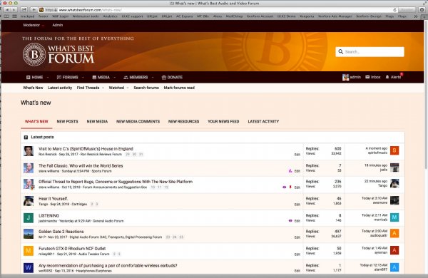
Note, we do have a simlar list for Latest Posts and New Posts, but Latest activity is very different data set.

The way Xenforo has build the software is to allow members to Tailor the user experience.

So if you only want to see unread posts and go through all those, you can set that in FILTERS tab. I explained this to DDK.... And you can preset posts as read. It is like email, you can set as read, so you know at a glance you have scanned those.

And you have the cool Admin/Inbox and Alerts tab top right. I use that a lot personally, as I tend to keep in an borrower area of my interests, not trawl the whole site.

Lets face it, some want to spend 5 minutes in the site 4 times a day, so will use the right side tab like I do. Others will have more time and do it in an evening session, so will trawl the unread list of your subscribed list.

TBH it is all good in my book, give the members choices. I didn't quite expect the bashing, but hey, you don't have to eat the mayo just because it's on the table.

Peace to all and good will, and remember, we are talking about our hobby... it is supposed to be a positive.

4.jpg4.jpg3.jpg2.jpg1.jpg
 
Last edited:
It's actually somewhat in the middle, tee hee. If you click on new posts you will see it just below the new posts bar
 
But I am afraid I am confused about something. How do your comments about visual display and locations of tabs address my question about why you are finding conversations extremely hard to follow?

So again, there is the text and then there is the presentation. If the presentation is not inviting one to read, one may not want to follow the discussions. I would put the split at 50/50, and afgter having caught up with what everyone else said since last night, let me offer some other examples, with a couple outside WBF:

1) The print TAS publication has moved to three uneven columns in the reviews - I cannot think of a dumber thing to do in print, so I no longer really read their reviews, apart from the opening statements and the conclusion. Worse, I find Stereophile's presentation in the entire magazine unbrearable, so I only read Fremer, the conclusions, measurements and ads.

2) There are books so thick in their print, that I just don't read. By contrast, those with short sentences and frequent paragraphs make reading inviting. Even the roundness of the font used makes a difference.

3) When reading the activity stream here, I cannot easily make out who's saying what, because of the presentation: the information overload I mentioned before, the lack of highlight of the poster and the thread name, and more importantly, the preview text is so short that I cannot easily gauge interest in what the person may have to say, so I don't read it. If the intention is to make me click to read more, it's not succeeding.

4) The lack of font contrast in either New Posts or Activity Stream is not inviting exploration; compare with just about any other site, audio or not, that I can think of. Make things stand out

5) The boxiness I mentioned before makes reading a thread tiring, so cannot follow the conversations because I want to stop reading. Think of it this way: assume you are looking at a glamorous painting, then consider, what does the frame around it contribute? Choosing a frame is paramount to getting one to keep his/her eyes on the painting - it must blend and enhance the painting.

6) Focus shifting, as explained earlier, makes one want to also stop reading, so again, can't follow conversations. Tima mentioned that having the View Older Posts link on the bottom right feels like flipping a newspaper page, but I see it differently: with the newspaper, your eye focus does not shift, since your hands instinctively find the page corner and flip it; here, eye focus shifts all the time to try to find the link, then get back to the left to read content. This is one of the reasons some also suggested infinite scroll - just keep scrolling in a more natural way

7) Consistency again: if I can't easily find the links, why would I bother to visit in the first place

I appreciate the fact that it costs money and time to make changes, but as someone else put it: don't break user expectations; and I will add: don't fix what's not broken... Comparing with head-fi, I have to admit, that is even worse than WBF, so no idea how they ramped up to so many users. At any rate, these are my thoughts; let's see if site traffic here increases, or drops. I am sorry that I am one of the detractors...

PS: Can't believe @ddk and I agree!!! LOL
 
Last edited:
Status
Not open for further replies.

About us

  • What’s Best Forum is THE forum for high end audio, product reviews, advice and sharing experiences on the best of everything else. This is THE place where audiophiles and audio companies discuss vintage, contemporary and new audio products, music servers, music streamers, computer audio, digital-to-analog converters, turntables, phono stages, cartridges, reel-to-reel tape machines, speakers, headphones and tube and solid-state amplification. Founded in 2010 What’s Best Forum invites intelligent and courteous people of all interests and backgrounds to describe and discuss the best of everything. From beginners to life-long hobbyists to industry professionals, we enjoy learning about new things and meeting new people, and participating in spirited debates.

Quick Navigation

User Menu