Turns out I can only type in a small amount of text into a PM, after which the system refuses to display 'preview". That is also why our PM exchange from just now went fine, Steve, because it was just one or two sentences at a time.
Official Thread to Report Bugs, Concerns or Suggestions With The New Site Platform
- Thread starter Steve Williams
- Start date
You are using an out of date browser. It may not display this or other websites correctly.
You should upgrade or use an alternative browser.
You should upgrade or use an alternative browser.
- Status
- Not open for further replies.
Dear Steve and Admin,
Suggestion:
Show links underlined as the default behavior for a link in WBF. There are lots of good reasons to do this and they all come down to making a link clearly visible for all users.
Below is an excerpt from a recent message on this topic taken from a thread where links were posted but not easily seen: In that previous sentence I intentionally underlined the link (the word 'message') . The suggestion is to have the forum software do this automatically.
I don't know what others see but in Firefox (latest) WBF links are not obvious in either my android tablet or my win7 main computer.
Thank you for your consideration,
tima
good idea Tim
i forwarded this to Julian to see if we can make that happen.
Steve, Julian - any further thoughts on this? Making the default for links to show as underlined? Thanks.
Check ...
1. https://en.m.wikipedia.org/wiki/Dark_Waters_(2019_film)
2. https://en.m.wikipedia.org/wiki/Dark_Waters_(2019_film)
Tim, you prefer #2 (underlined) for a link?
I added [ ] underlined brackets (beginning & end of the link) [/] for #2 (I do it sometimes).
If using a device with a browser that allows a dark mode it is easier to see the link without underlining it. But without a dark mode (like here using a tablet) the link is gold color against a white background, a little harder to see with the black lettering (red would be better) and even more so to certain pairs of eyes...so I can relate to that.
Last edited:
I'll look again at this. If we have to create a new style it may add links everywhere, i.e. other areas on the forum. It needs to be isolated to post text styles.Check ...
1. https://en.m.wikipedia.org/wiki/Dark_Waters_(2019_film)
2. https://en.m.wikipedia.org/wiki/Dark_Waters_(2019_film)
Tim, you prefer #2 (underlined) for a link?
I added [ ] underlined brackets (beginning & end of the link) [/] for #2 (I do it sometimes).
If using a device with a browser that allows a dark mode it is easier to see the link without underlining it. But without a dark mode (like here using a tablet) the link is gold color against a white background, a little harder to see with the black lettering (red would be better) and even more so to certain pairs of eyes...so I can relate to that.
Me I'm fine 100% with the way it is. I don't have a problem to see all the links.
If more members like Tim would mention that they cannot see the links, I would use underlined brackets all the time for them. It's just the way I am and always have been since I was born.
I tried using different colors but that didn't work.
This works fast enough ... https://en.m.wikipedia.org/wiki/DuPont_(1802–2017)
I'll look again at this. If we have to create a new style it may add links everywhere, i.e. other areas on the forum. It needs to be isolated to post text styles.
I agree. I'm not suggesting to add links, just make existing links within posts, particularly words or phrases that have links more obvious. As it stands I have to pass the cursor over a word to discover it is a link. When I post a linked word, I underline it, but most do not do that.
I see ... a link through a single word or a date (number) or both ...
Test:
#1 You can check a 1917 Film Review on livemint.
#2 You can check a 1917 Film Review on livemint.
The 2nd option is easier to see (link).
A link that starts with https (full address) is no problem.
But if only one word is used like here, then underlining the word "here" is the way to go. ...Complètement d'accord.
How about suggesting that whoever creates the link simply go back and change it to a different color where it is easier to seeI agree. I'm not suggesting to add links, just make existing links within posts, particularly words or phrases that have links more obvious. As it stands I have to pass the cursor over a word to discover it is a link. When I post a linked word, I underline it, but most do not do that.
How about suggesting that whoever creates the link simply go back and change it to a different color where it is easier to see
Sure, and that is often done.
Anything could work that makes enough of a differentiation so users can recognize what text is linked. Years back it was almost standard practice to show links in a specific color, often blue and to underline them. Nowadays style is all over the place.
Color can work as a differentiator. It is a bit more bit tricky given different display performance, user selectable color schemes or styles, and user ability to see color contrasts. I don't know if there is any practice taken at WBF with regard to ADA (Americans with Disibilities Act) compliance or users with visual impairment such as color blindness. Just a thought. I'm advocating for useability, not a specific implementation.
How about suggesting that whoever creates the link simply go back and change it to a different color where it is easier to see
I've tried; it doesn't work.
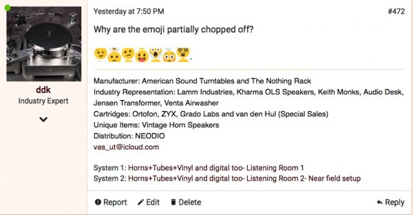
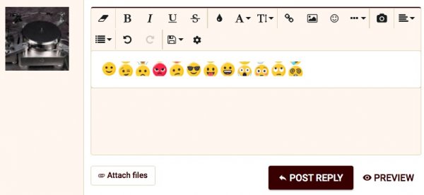
Why are the emoji partially chopped off?
.
They look to me as they always have
They were full images this started happening recently.They look to me as they always have
Can you provide a screenshot?They were full images this started happening recently.
Your's above look good to me
That's interesting, I see the problem on 4 Macs using Safari but not with Google Chrome.good question as I don't think anyone else is seeing the same issue
david
Clear your browser cache and reboot. Looks like it got corrupted.
Already did that.
david
- Status
- Not open for further replies.
Similar threads
| Steve Williams Site Founder | Site Owner | Administrator | Ron Resnick Site Owner | Administrator | Julian (The Fixer) Website Build | Marketing Managersing |


