Official Thread to Report Bugs, Concerns or Suggestions With The New Site Platform

Status
Not open for further replies.
Actually, the more I think about it, this doesn't make sense unless the Rennlist server is much different. They have been around a lot longer than WBF and I'll surmise their picture libraries are even more than WBF. Also, aren't images "served" only if they are scrolled to?
In any case if WBF wants to be leading edge in substance as well as looks infinite scrolling should not just be dismissed. Maybe not for today but it should be in the near future evolution plan.
Hello Kingsrule
Yes, it is sometimes called 'lazy load' and is based on Ajax script. The call to display a thousand posts in a window is not just about the attachments, it is also the load on the MySQL database. And if you have many user online at once, the resource piles up. It is not a good use of power IMO.

It is also about the ability to get to a section of a long thread. On head-fi-org I have read some threads with 250 pages. And to get back to the section where I left off the day before, I had to treat it like a book, go to page 133 for example. That would be impossible with an infinite scroll.

I agree on both points. I don't care about infinite scrolling.
 
Will look at this. I wouldn't recommend moving into the menu bar though, as that is high in the window. I'll look at the possibility to place adverts above the post button instead.

Along with placing the "Post Thread" button below the advertisements, I'd like to see the Thread Title and Search Box below them as well. Understanding that having the Thread Title near the top of the page can be useful because you don't have to scroll through the advertisements to see where you are But having a second instance of the Thread Title below the ads would be helpful as well.

All three could be on a line, left, middle, right: Post Thread .... Forum Title .... Search Box.

The banner ads are among the largest ads you'll see on any audio forum. From an end-user perspective, I'd like to see the advertisements at the very top of the page or interspersed within the page. You'd see them when the page loads, but you wouldn't have to keep scrolling through them to get to navigation. Yes, I get the idea of monetizing the forum and I'm sure we'll be seeing advertisements filling the right hand column of many pages - okay fine - but ads should be placed in a way that causes you to see them without making them a hinderance to forum use.

I understand you want the user to see some options available to them above the ads when the page first loads, which already led to duplicating some navigation above and below the ads, so it looks like there is some recognition of the issue. Thanks for listening.
 
I have been unable to load the site at all today with Chrome, Firefox or Microsoft Edge browsers.

Cleared all browser data and tried again without success.

Able to post this message with the Opera browser with VPN.

Problem with the site or is it something on my end?
 
Checked my router, nothing there blocking the site.

I turned off my firewall to see if that was blocking the site, still couldn't access.

Also turned of my Antivirus (ESET) and then turned off Malwarebytes, no access.

Something unusual is going on but I haven't been able to figure it out.
 
Checked my router, nothing there blocking the site.

I turned off my firewall to see if that was blocking the site, still couldn't access.

Also turned of my Antivirus (ESET) and then turned off Malwarebytes, no access.

Something unusual is going on but I haven't been able to figure it out.
I have asked Julian to have a look at it for you. He’s working on it
 
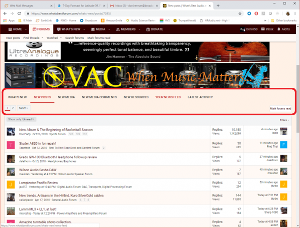
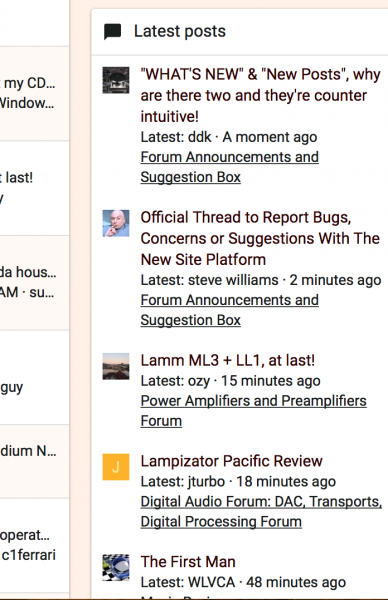
Why are there two menus with exactly the same title, WHAT'S NEW & New Posts and we're forced to continuously navigate between the two aimlessly to piece the threads together? I don't know about anyone else but if I as WBF veteran find it maddening and confusing imagine newcomers trying to figure out what's what and what's missing under one menu vs the other with a title which means exactly as the the other one.

Why in the world doesn't my "new post" show under "New Posts" and can only be seen under "WHAT'S NEW"? What's the logic behind this? Why click on one menu and see a few measly posts then have click again to have the option to see more threads when that option can up with the first click? Then click again to navigate to another section to find another menu with literally the same name to drop down a few threads again only to be forced to click one MORE AGAIN just to get a longer list that doesn't actually contain all the latest posts?

What's wrong with a more elegant approach with one menu and dropping down the last 20 or 30 posts so one can scroll through the content easily without all the pointless clicking?

Anyone else getting confused?

david
 
  • Like
Reactions: tima
I personally prefer latest activity
 
I'm old and apparently don't like change. So, FWIW, I'm not a fan of the new forum cosmetics/layout. Seems too much work to navigate to the places I like to go. I may get use to it ... and then again, maybe I won't!!


IMO Chuck it's easier to navigate than the old site. Old habits die hard
 
I can reduce the available titles to click. So we only have New Posts, Latest Activity. So deactivate Latest Activity. The reason for Latest Activity is the new forum has Media sections that can contain latest images uploaded and discussions. Right now, until more members start to use the additional Media or other facilities, it can seem like the navigation is repeating.

We have Your Posts now which is new. Before I beleive we had to go to Account > Your Posts instead.
 
I can reduce the available titles to click. So we only have New Posts, Latest Activity. So deactivate Latest Activity. The reason for Latest Activity is the new forum has Media sections that can contain latest images uploaded and discussions. Right now, until more members start to use the additional Media or other facilities, it can seem like the navigation is repeating.

The issue is the functionality of "WHAT'S NEW" & "New Posts" they mean the same thing and look the same but there are confusing inconsistencies between the two, not to mention the multiple clicking needed. Latest activity is a very different feature which is unfortunately hidden in "Quick Navigation" which requires still more scrolling and clicking to get to. I would like to see Latest Activity next to WHAT's NEW in the top menu and delete New Posts.

Also why not have the additional pages and threads show up instead of additional step of "View More"?

Edit- Steve offered a workaround for New Posts but it isn't just me who's confused and the workaround marks all forums at once as read when I haven't even seen most of them. The default is show only unread so one can't see their latest posts under that menu without further clicking and changing defaults, but only if one can figure it out otherwise you end up clicking and menu searching for them.

david
 
David what you still find difficult to comprehend is What's New is more than just new posts. It also Whats new in Media, authors, posts etc

This is the way it is for now David. It isn't that difficult for you to comprehend. If I can navigate my way through, then so can you

Enough said
 
Status
Not open for further replies.

About us

  • What’s Best Forum is THE forum for high end audio, product reviews, advice and sharing experiences on the best of everything else. This is THE place where audiophiles and audio companies discuss vintage, contemporary and new audio products, music servers, music streamers, computer audio, digital-to-analog converters, turntables, phono stages, cartridges, reel-to-reel tape machines, speakers, headphones and tube and solid-state amplification. Founded in 2010 What’s Best Forum invites intelligent and courteous people of all interests and backgrounds to describe and discuss the best of everything. From beginners to life-long hobbyists to industry professionals, we enjoy learning about new things and meeting new people, and participating in spirited debates.

Quick Navigation

User Menu