Just one suggestion - the latest activity button is intended for a fast consult update - IMHO it should not report the full images of the posts in the list.
Official Thread to Report Bugs, Concerns or Suggestions With The New Site Platform
- Thread starter Steve Williams
- Start date
You are using an out of date browser. It may not display this or other websites correctly.
You should upgrade or use an alternative browser.
You should upgrade or use an alternative browser.
- Status
- Not open for further replies.
Is it necessary to have these system threads on the header page? I'd really just prefer the contents/index.
Don't need to be reminded Tang has 3 more tts than me EVERY time I log in LOL.
Kinda gives me a complex.
I concur Marc.
Many thanks guys, yes. Now have the delight of delete and edit capacity... ahhh yes, I love the smell of a good delete in the morning!Yes, the drop down menu that I have has report like yours on your screen shot on the left and reply on the right but on mine just missing both the edit and delete command buttons. So at least as we are both using iPhone then the issue might be just one of permissions maybe.
Hmmmm, might have to edit that as it sounds perhaps just a little wayward...
Is it necessary to have these system threads on the header page? I'd really just prefer the contents/index.
Don't need to be reminded Tang has 3 more tts than me EVERY time I log in LOL.
Kinda gives me a complex.
Hi Marc
as best I know the add on that allows us to bring the articles forward from the forum does it like this. Sorry it bothers you but we plan on highlighting at least one system every month. When it's your system I'll make sure that your system isn't visible for all to see
as best I know the add on that allows us to bring the articles forward from the forum does it like this. Sorry it bothers you but we plan on highlighting at least one system every month. When it's your system I'll make sure that your system isn't visible for all to see
I'd like to give a summary and report why the forum was closed for several hours today. Our prime task today was to relocate the new live site to the ROOT directory from where it was sequestered as well as to hide the old forum (which we have archived) so it won't be found during a Google search
Ked and micro were aware of the issue this morning as we were moving the forum to the ROOT directory. We thought it would take 1-2 hours at the most
Well suffice it to say WBF is filled with hundreds of thousands of attachments. I was told there were 32 folders to transfer and each folder had 30,000 attachments and it took far longer than anticipated
All of this has finally been finished and we are now left only with the task of setting the proper redirect for Google and its search bots to find us as well as completing our SEO which was started 98 weeks ago
I don't anticipate any further major issues
Thanks again everyone for being patient and understanding
Thanks for all the work, Steve! Seems like everything was thought through.
I am BTW writing from my phone and love the mobile functionality now that I've figured it out
I am BTW writing from my phone and love the mobile functionality now that I've figured it out
Thanks for all the work, Steve! Seems like everything was thought through.
I am BTW writing from my phone and love the mobile functionality now that I've figured it out
I also love the mobile version. Have you tried it in Landscape mode as everything expands
FWIW, I have a couple of comments to make:
1) The site's styling and presentation is just bland: basic table presentation; square boxes; unusual colors; not enough contrast, especially between thread titles and text
2) Hard to follow threads and conversations, because of styling issues
3) Overall, not as inviting as the old one, despite its problems
Suggestions:
1) Each thread title should be in bold typeface, to stand out; different color too
2) Spacing between posts in Activity Stream, to separate them from each other
3) Other colors that accentuate contrast, even a textured backsplash
4) Different, rounder fonts
5) Overall, add a lot more pizzazz - A LOT
The bland color as you call it is the identical color used a very old newspaper in the UK which has stood the test of time many say because of its color
let us look into and consider your suggestions but TBH if we go your way and add some pizzazz there would be nothing common but a place to do whatever you want
Not sure if I like more pizzazz. Different fonts are included at the top of the postbox
let us look into and consider your suggestions but TBH if we go your way and add some pizzazz there would be nothing common but a place to do whatever you want
Not sure if I like more pizzazz. Different fonts are included at the top of the postbox
I still can't edit my posts and my moniker doesn't reflect industry affiliation.
I have to agree with ack the backgrounds and layouts are somewhat counterintuitive and complicate navigation, maybe it's something we'll get used to in time but right now it's problematic for me.
david
I have to agree with ack the backgrounds and layouts are somewhat counterintuitive and complicate navigation, maybe it's something we'll get used to in time but right now it's problematic for me.
david
you're smart David.Think of it as learning to do SRA
PM me what your moniker said on the old site and I can fix that now
As to the edit button, I'm sure it is a matter of user group permissions and i'll get that sorted out for you tomorrow
PM me what your moniker said on the old site and I can fix that now
As to the edit button, I'm sure it is a matter of user group permissions and i'll get that sorted out for you tomorrow
The Privacy option:
"Show your online status This will allow other people to see when you are online."
does not appear to be working or I don't understand it. I see my 'handle' wherever 'members on-line' is shown, so I assume others see it as well.
Steve,
I did not hear if this is an acknowledged bug or ....
If you say you don't want your on-line status shown, the software still shows it.
The views are present for every thread if you look at the forum the thread is in it tells you how many views and posts
as for seeing the most recent post first rather than the way we have it now....we have always had the mosts in chronological order with the newest post at the top
I will check on the FAQ's
Re: View Count
If you're if you choose "What's New" from the top most menu ====>>
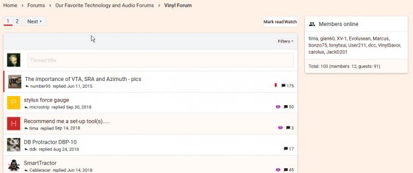
Then choose "New Posts" you do see View Count

However, if you take this path:
Forums ===>
Starting in the VINYL FORUM

Click on "Calibration Devices" ====>>
This shows the threads in that sub-forum. This is where View Count is missing.

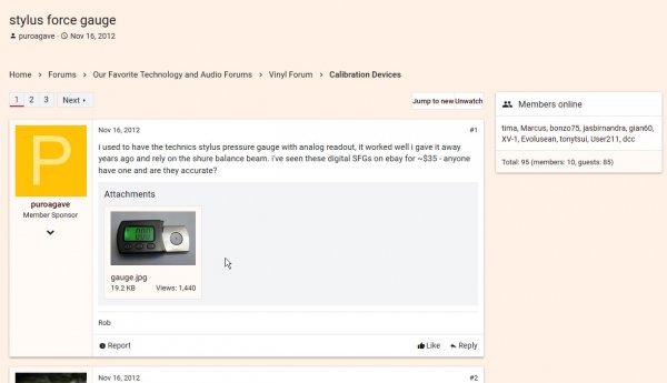
Then pick a thread: Click on "stylus force gauge" thread ======>>
No View Count here either.

VIEW COUNT IS NOT SHOWN anywhere on the navigation path outlined above.
(unless I'm not seeing it, which is possible.)
Attachments
The login is fine and WBF posts appear in my inbox and from those I can go straight into the site.
WBF has been one of my top sites which is there for me when I open Mozilla and enables me to go to the site. The new site has appeared there with my other topsites but wouldn't log me in. I've deleted it a couple of times and tried when it reappeared with the same data error result. It's not appearing in the top sites at the moment so can't do a screen grab.
All working fine now thanks
Hi Steve,The views are present for every thread if you look at the forum the thread is in it tells you how many views and posts
as for seeing the most recent post first rather than the way we have it now....we have always had the mosts in chronological order with the newest post at the top
I will check on the FAQ's
Sorry - I seem unable to find it. In the old system, we had the option of having a thread show oldest posts first...or last. I always did last so i did not have to scroll down or flip pages and scroll down to find the final post. it just appeared as soon as i hit the thread.
Is there any way to do that in the new system?
- Status
- Not open for further replies.
Similar threads
| Steve Williams Site Founder | Site Owner | Administrator | Ron Resnick Site Owner | Administrator | Julian (The Fixer) Website Build | Marketing Managersing |


