Official Thread to Report Bugs, Concerns or Suggestions With The New Site Platform

Status
Not open for further replies.
Does anybody agree with me that the "Jump to New"" and"Unwatch" tabs should be seperated physically?

Since they are visually physically connected I sometimes hit the "Unwatch" tab when I mean to "Jump to New," and since "Jump to New" and "Unwatch"are opposite concepts (if you are jumping to new that means you are interested in the thread and in seeing recent posts, the opposite of wanting to not monitor that thread by unwatching it) it just makes sense to me that they should not be adjacent to each other.

Hi Ron

I never use those buttons and ignore them but having read your explanation i can understand the confusion. Let's see about separating those 2 buttons
 
IMHO we should be able to edit the OP of the Buy and sell forum for a reasonably long time. Although we can add a bew post referring it was sold, people miss it and go on sending PMs asking to buy ...

so are you suggesting that you be allowed to delete the post??

Typically the member posts "sold" and when we see that the thread is closed. Not sure what more you can do
 
I agree, Bob, with increasing the edit time. I write a lot of posts from my cell phone, and I often do not see typos for hours later until I get to a computer and a big screen.

You got it Ron. Just for example few hours ago I noticed that a post I made Monday could have use some "perfecting" in clarity. That's what motivated me to make a small suggestion.
* Previously I believe we had a week, with vBulletin, I'm pretty sure, or was it ten days?

Plus I always have typos of course, and my grammar on verbs, present and past tense, often needs correction. It's important because it could have a totally different meaning. My English language skills are not as good as my French, it is one of my handicaps @ times.

But we do adapt with the time we have on our edits.
Editing is important in my book, and if time helps the better it is.
 
Last edited:
Tima
I can't replicate your issue. Can you tell me which page you were on to then click the Latest Posts navigation? It is the navigation top left on the forum list page and the home page I think you mean.

I have tried in the forum list view, home and various threads view, all seem to be taking me to latest post at the top of the list.

Per my post #309 in this thread:

I was on the page delivered when I click 'New Posts'. Picking a thread on that page produced the results described.

I experienced the issue but could not reproduce with any consistency. But over the past week or so, it has happened several times.

As I speculated in #309, this will be difficult to track down because it appears to happen randomly - or at least I have not discerned the pattern yet. I don't know if you work with the actual code, but I'd look at how the link on the thread title is generated. This is PHP?

Thanks.
 
Hi Ron

I never use those buttons and ignore them but having read your explanation i can understand the confusion. Let's see about separating those 2 buttons

Thank you, Steve.
 
Is it possible to press a button where the 4 giant advertisements do not take up the entire page that you have to press page down when you enter say new posts?

those 4 constant brands are such that I have completely switched off ever contemplating buying them as its so annoying.
 
Is it possible to press a button where the 4 giant advertisements do not take up the entire page that you have to press page down when you enter say new posts?

those 4 constant brands are such that I have completely switched off ever contemplating buying them as its so annoying.
If you were just in the the Latest activity page, you wouldnt see the 4 giants Shane. ;)

Tang
 
Is it possible to press a button where the 4 giant advertisements do not take up the entire page that you have to press page down when you enter say new posts?

those 4 constant brands are such that I have completely switched off ever contemplating buying them as its so annoying.

Once you scroll down you do not see those four banners anymore.

Declining to consider four of the best brands in the industry because you see their banners seems to me to be a disservice to your audiophile objectives.
 
If you were just in the the Latest activity page, you wouldnt see the 4 giants Shane. ;)

Tang

not a big fan of the latest activity page Tang. New posts is what I view and its a PITA imo. turns me off the advertisers and a lot of others I suspect.
 
Once you scroll down you do not see those four banners anymore.

Declining to consider four of the best brands in the industry because you see their banners seems to me to be a disservice to your audiophile objectives.

Hi Ron

my suggestion is to not have those 4 GIANT banners there 100% of the time. people just ignore them or get irritated by them like me and start to not visit the site as much anymore.
How about one or 2 lines of ads and swap the 4 around. At least that would be a change for the viewer.

many web sites have some ads down the side so they are not shoving their logos into one's face.


cheers
 
Thank you for the suggestion, but we will not be making any changes to the banner displays.
 
The first link I clicked above brought me to the first post.
Then I clicked on the second link and it brought me to the Last post.
Then I clicked back on the first link and it brought me to the third post (last)!

I did that several times with both links and afterwards they always brought me back to their last posts.
 
Okay here's an example
11:11PM CST 11-2-18

NEW POSTS
Clicked on Thread Title:

Analysis Audio versus Magnepan - went to first post in thread

The Colibri “Master Signature” - went to last post is thread

just for my clarification are these threads new threads to you or have you read these threads before.

If you click on the thread title if it is a new thread you will be taken to the first post. If you are revisiting the thread and click on the title it will take you to your first unread post in that thread
 
buttons.jpg
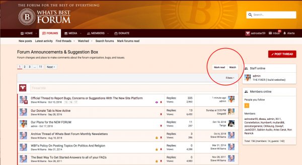
Buttons top right. Mark Read, Unwatched etc. These were a bit tight before as pointed out by Ron. I have dug around at length in Xenforo and found the location of the code to add some space for these. It looks much better clear now.

BTW the odd comment about me knowing PHP / Code. Can we drop that please guys? I know enough to get around. But I would point out knowing PHP is not the whole picture. How a website code has been assembled is a big part of the puzzle. If you were a mechanic and trained to service small cars, good luck servicing a train and without the manual. You get my drift. Also you do realise the 3 Xenforo guys spent 2 years full time writing the Xenforo engine, and have spent 5 years since then updating it and fixing things. Anyone think they can do a better job here, please step forward. Ok rant over. moving on.
 
PMs (Conversations). You have been UPGRADED.

I originally set PMs to not allow adding images, only set Admins and Moderators. But yesterday I had a change of mind, and have now set everyone who is registered to be able to add images to PMs.

NOTE
Posts in the normal threads (or a PM) with an image in the post, when that is sent as a notification to a member who has subscribed to that thread or is watching, or added some content, when they get that notification they now see the image in their email! This is a very cool thing. It brings members back to comment, photos generate more excitement than lots of text. This feature didn't happen in vBulletin.

The image that appears in your email inbox is not containing the image file, it is loaded via internet connection from the WBF server, so no problem with data filling up your email inbox.
 
Tima it seems to take me to your last post in that thread. Is that correct? If I click the title it takes me to the last post as normal.

The problem is that it varies and seems random. I don't think you can pick out any specific thread that always exhibits the same behavior. As noted in my example abve, two threads, two different destinations (first post / last post.)

I suggest we first establish what we want or expect to happen. Here's my understanding - but it may be different what you guys have in mind:

Clicking a THREAD TITLE (wherever it is located) takes you to the FIRST post in the thread.
Clicking the THREAD TIMESTAMP of the last reply (rightmost column) goes to the LAST post in the thread.

-or- some variation, whatever you want. I believe one always should be able to get to the FIRST post and LAST post from any thread listing. And most important, the behavior should be consistent where ever threads are listed.

make sense?
 
just for my clarification are these threads new threads to you or have you read these threads before.

If you click on the thread title if it is a new thread you will be taken to the first post. If you are revisiting the thread and click on the title it will take you to your first unread post in that thread

Oh wow - I did not make that differentiation. That's what I call 'context sensitive' navigation - where a link goes depends on the current user's context relative to a given thread. Personally, I don't buy into end-user specific navigation. You guys may feel different. I much prefer the same behavior across the forum - that way I know what to expect and don't have to think about my context. This place is so broad in its coverage that consistency of behavior should be a priority. (That's the way I think about it.)

I'd suggest there is possibility of the option "Last Read" - that makes it clear. Don't know how easy or hard it would be to include such a link. So for a given thread you could use:

Thread Title - goes to first post in a thread.
Last Read - goes to the last post the current user has seen
Timestamp - goes to the latest (last) post in the thread.

As I commented to admin, I believe you should always be able to go to the first and last post in a thread. Adding 'Last Read' would be a bonus.
 
Status
Not open for further replies.

About us

  • What’s Best Forum is THE forum for high end audio, product reviews, advice and sharing experiences on the best of everything else. This is THE place where audiophiles and audio companies discuss vintage, contemporary and new audio products, music servers, music streamers, computer audio, digital-to-analog converters, turntables, phono stages, cartridges, reel-to-reel tape machines, speakers, headphones and tube and solid-state amplification. Founded in 2010 What’s Best Forum invites intelligent and courteous people of all interests and backgrounds to describe and discuss the best of everything. From beginners to life-long hobbyists to industry professionals, we enjoy learning about new things and meeting new people, and participating in spirited debates.

Quick Navigation

User Menu