Xenforo Update Completed-The Thread To Report Bugs

microstrip

VIP/Donor
May 30, 2010
20,806
4,698
2,790
Portugal
Micro-the more I look at it I honestly see zero concerns as to how it can be distracting. The entire purpose of a "liked"post in the latest activity is that it tends to bring readers back to that thread so I am going to say that the "blue"likes stay. What is affecting your reading pleasure that is any different than seeing the members avatars to the left. I am sure they don't bother you

We are looking for bugs in the system and then if possible we will look at personalized requests such as yours

Fortunately people do not fill their avatar space with the same blue hue the likes are being shown. Probably Marty, who is a specialist in ophthalmic, can explain it much better than me but old netiquette rules on the use of color were based on eye spectral sensitivity.

I understand that giving an higher priority to likes than to replies in a "latest activity" button is a forum administrator decision, I accept your point, although I disagree with it.
 

Steve Williams

Site Founder, Site Owner, Administrator

Steve Williams

Site Founder, Site Owner, Administrator
What are the trophy points? Makes me feel like we're in 3rd grade!

Where are the Emoji?

dave
Trophy points have been a part of Xenforo since day 1. They are automatically awarded when a member has contributed to the forum in one of countless different ways. They do tend to keep members involved with the forum and none of us are in grade three.

The emojis are still there. You need to click on the vertical 3 dots as shown

Screen Shot 2020-10-28 at 7.20.09 AM.png
 
  • Like
Reactions: ddk

Steve Williams

Site Founder, Site Owner, Administrator
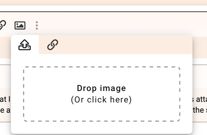
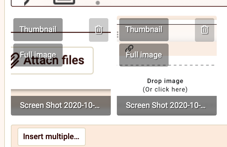
I posted a new 'toon today and noticed that I was unable to make the image full size because this attachment option was missing. If you want consistency, there will have to be a fix, otherwise the user/member will have to click on the smaller image.
Jim

The attachment option is present

Screen Shot 2020-10-28 at 7.25.37 AM.png Screen Shot 2020-10-28 at 7.24.44 AM.png
 

wil

Well-Known Member
Jul 22, 2015
1,480
1,506
428
The green flashing is the new way to show you and I are on line. It used to be a solid green dot at the top left of each avatar
The less stuff flashing and pulsing, the better. It's annoying like a pop up ad. The solid green dot is fine-- why make it pulsate?
 

Steve Williams

Site Founder, Site Owner, Administrator
The less stuff flashing and pulsing, the better. It's annoying like a pop up ad. The solid green dot is fine-- why make it pulsate?
This has already been reported by everyone including me when I first saw it. We are looking for a fix but the flashing light is not our doing but rather a function of the new Xenforo update. Im sure we will get it fixed
 

Steve Williams

Site Founder, Site Owner, Administrator
The less stuff flashing and pulsing, the better. It's annoying like a pop up ad. The solid green dot is fine-- why make it pulsate?
Wil

we get it. Everyone feels the same. We’re working on it
 

Folsom

VIP/Donor
Oct 25, 2015
6,024
1,490
520
Eastern WA
The less stuff flashing and pulsing, the better. It's annoying like a pop up ad. The solid green dot is fine-- why make it pulsate?
I'm with that, too... I don't really like the off colors either. I'd rather take the time to read a few little things.

The expanding signature thing seems pointless because it's usually expanding like two lines... and the button is broken into text.

Not sure how quoting works now? What if I want to break quotes up?

I like that the PM's are just a mail symbol however.
 

Steve Williams

Site Founder, Site Owner, Administrator
I'm with that, too... I don't really like the off colors either. I'd rather take the time to read a few little things.

The expanding signature thing seems pointless because it's usually expanding like two lines... and the button is broken into text.

Not sure how quoting works now? What if I want to break quotes up?

I like that the PM's are just a mail symbol however.
Once again the expanding signature is there because the default in Xenforo is 5 lines. My signature was 6 lines and I had the red link until II made my signature 5 lines and the expanding signature link went away

Quotes are still there and of course you can still break up quotes Screen Shot 2020-10-28 at 10.00.56 AM.png
 
  • Like
Reactions: Folsom

bonzo75

Member Sponsor
Feb 26, 2014
22,434
13,467
2,710
London
The magnifying glass of search does not respond when I click it on my iPhone. It responds only when I hold the phone horizontally (in landscape)
 
  • Like
Reactions: Steve Williams

Steve Williams

Site Founder, Site Owner, Administrator
The magnifying glass of search does not respond when I click it on my iPhone. It responds only when I hold the phone horizontally (in landscape)
Good call Ked. It doesn’t on mine as well.
I will submit that one to be fixed
 
  • Like
Reactions: bonzo75

Steve Williams

Site Founder, Site Owner, Administrator
The magnifying glass of search does not respond when I click it on my iPhone. It responds only when I hold the phone horizontally (in landscape)
This has been fixed
 
  • Like
Reactions: bonzo75

Steve Williams

Site Founder, Site Owner, Administrator
I also see in my post above that my signature section is collapsed with the red link below it to expand my signature

This will need to be fixed
This has been fixed
 

Steve Williams

Site Founder, Site Owner, Administrator
We have spent the past several hours rechecking everything and we are not seeing anything else that stands out

We have left to do (if possible) the return to use of our original Ding Bats which we had with the previous version

Also thanks to Ked for pointing out the search function problem on his mobile. When we installed elasticsearch we couldn't figure you why it lacked the expanded screen that we had in the standard search. It was something simple on our part that once done, literally fixed all of these reported bugs without us having to do anything further. In fact if this simple thing had been done during the update we would have come through without any of these small bugs which are now gone
 

tima

Industry Expert
Mar 3, 2014
5,777
6,818
1,400
the Upper Midwest
A few things to mention that I ran across when creating a reply to a post.

1. Replies containg quotes from another message now go into a box, with the author's name at the top left. This box does not operate like normal open text. Once a box appears, you can get rid of words inside it but cannot get rid of the box itself without first removing the words inside it and then removing the words outside of it. This burden was not available in the prior version. How do you get rid of the *&%$ box? Right now it looks like you have to delete the entire post to get rid of it.

If you delete all the words inside a quote box and continue to press the delete key, words outside the box scroll into the box, turning what you write into a quote from someone else.

2. Why turn the 'Preview' button into an ideogram and move it to the top of the edit area? The ideogram shows a magnifying glass on a piece of paper - magnifying glass typically means 'search'. Now you have to hover over it to learn that in means Preview. You have to scroll up to find it. The Preview function was fine as a button at the bottom of the edit area.
 

bonzo75

Member Sponsor
Feb 26, 2014
22,434
13,467
2,710
London
A few things to mention that I ran across when creating a reply to a post.

1. Replies containg quotes from another message now go into a box, with the author's name at the top left. This box does not operate like normal open text. Once a box appears, you can get rid of words inside it but cannot get rid of the box itself without first removing the words inside it and then removing the words outside of it. This burden was not available in the prior version. How do you get rid of the *&%$ box? Right now it looks like you have to delete the entire post to get rid of it.

If you delete all the words inside a quote box and continue to press the delete key, words outside the box scroll into the box, turning what you write into a quote from someone else.

2. Why turn the 'Preview' button into an ideogram and move it to the top of the edit area? The ideogram shows a magnifying glass on a piece of paper - magnifying glass typically means 'search'. Now you have to hover over it to learn that in means Preview. You have to scroll up to find it. The Preview function was fine as a button at the bottom of the edit area.


Why do you want to delete the box? It clearly demarcates what you are quoting. Whatever you type should be outside it
 

About us

  • What’s Best Forum is THE forum for high end audio, product reviews, advice and sharing experiences on the best of everything else. This is THE place where audiophiles and audio companies discuss vintage, contemporary and new audio products, music servers, music streamers, computer audio, digital-to-analog converters, turntables, phono stages, cartridges, reel-to-reel tape machines, speakers, headphones and tube and solid-state amplification. Founded in 2010 What’s Best Forum invites intelligent and courteous people of all interests and backgrounds to describe and discuss the best of everything. From beginners to life-long hobbyists to industry professionals, we enjoy learning about new things and meeting new people, and participating in spirited debates.

Quick Navigation

User Menu

Steve Williams
Site Founder | Site Owner | Administrator
Ron Resnick
Site Co-Owner | Administrator
Julian (The Fixer)
Website Build | Marketing Managersing